Hello World.

Nice! I’m incredibly happy to announce that we’re up and running. It’s been a while but we’re finally there, perfect timing :-). Hope you like the site and enjoy our products the same way as we enjoy creating them.

Feel free to grab a free copy of Folly, our theme for creative folks.

Enjoy!

Note: You can get discount coupon codes by following us on twitter or liking our facebook page.

Installing a WordPress Theme

To install a WordPress Theme you must have a working version of WordPress already installed. For information regarding installation of the WordPress platform, please see the WordPress Codex.

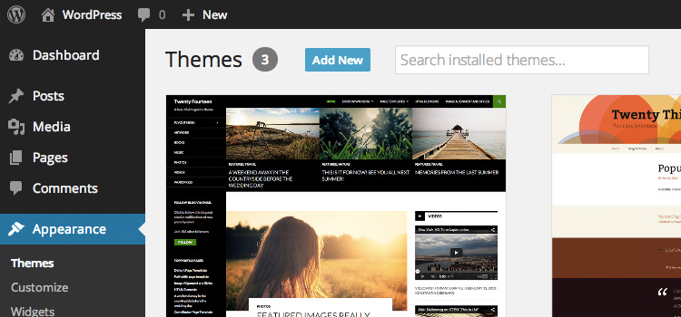
1. Login to your WordPress Dashboard and go to Appearance → Themes. Click “Add New“.

Figure 1: The Appearance > Themes section.

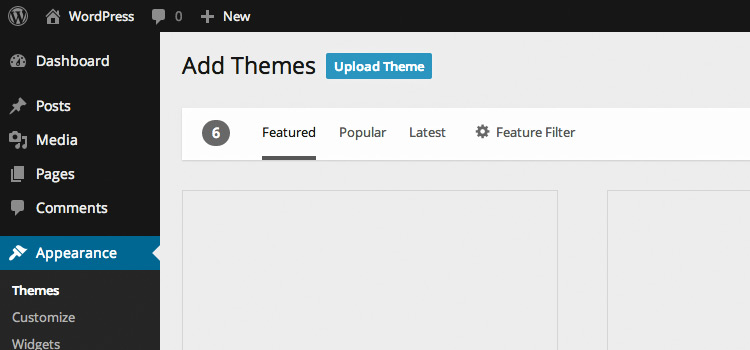
2. On the “Add Themes” screen, click “Upload Theme”.

Figure 2: The “Add Themes” screen.

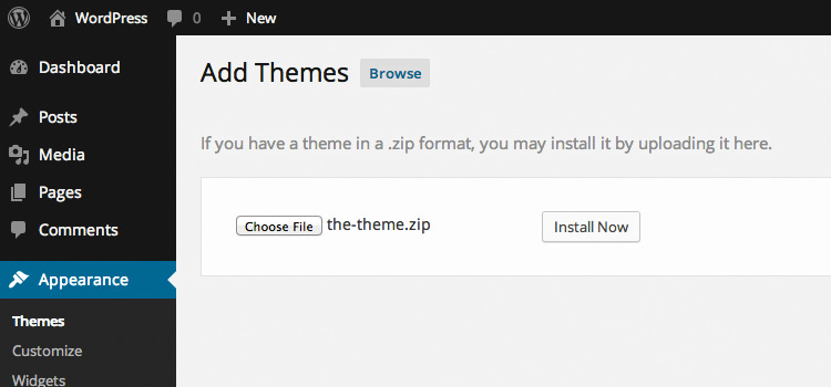
3. Choose the theme zip file you downloaded from NiceThemes and click the “Install Now” button.

Figure 3: Uploading the Theme zip file.

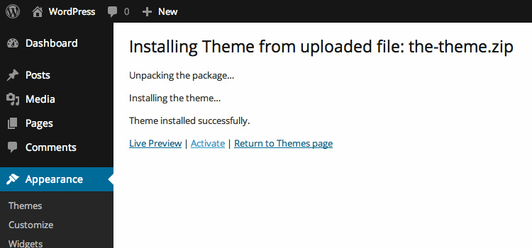
4. Activate your Theme by clicking the “Activate” link.

Figure 4: Activating the WordPress theme.

That’s all you need to do to install your WordPress theme. Some themes need some shifting around of the Widgets and Page Templates.

If you are installing your theme via an FTP Client, please make sure that the path is wp-content/themes/themename/ and not wp-content/themes/themename/themename, this will affect the ajax and commenting of your theme

Install Demo Contents

Importing Demo Contents is fairly simple and it takes no more than a couple minutes. To install a demo pack, you need to go to the “Smart > Install Demos

Once you’re on that screen you can browse the different demos and click the “Install” button to install any of them

You can check the demonstration video to learn how to import demo packs.

Important Notes

Avoid importing in Live Sites

Because of the nature of this process, we strongly advise you against using this feature on live sites. Its main purpose is to provide a quick start when creating new ones. But importing in live sites is a bad idea. And always, always, always back up your site before running the importing process.

New content will be added

Installing a demo adds new content to your site. This means that the new content will end up mixed with any content you may have now (unless you choose to remove it first by checking the box in the sidebar).

Do you want to remove content?

If you choose to remove the current content, your current pages, posts, categories, tags, widgets and plugin-related data will be erased. Choose this option only if you want to make a fresh start. Please have in mind that you need to have a backup of your site and we do not take responsibility for it.

Backup your site

The current state of the site will not be backed up. This means that this process can’t be automatically undone; if you may want to restore the site as it is before the import, you should perform a manual backup before proceeding.

Stay online

Some of the contents to import (mainly images) are hosted in the cloud. You’ll need to be connected to the internet to complete the import.

Be patient

Importing content for an entire site can take minutes, so grab a cup of coffee and have some patience while the contents are being installed. You can check the system status to see if your web server is ready for the import

Server Requirements

The one click demo importer need to meet the following requirements in order to work correctly. Please have in mind that you can check these by going to your system status page. If you don’t meet the requirements you will need to contact your hosting provider in order to make the changes.

  • WordPress 4.8 or higher
  • MySQL 5.6 or higher
  • PHP 5.6 or higher
  • PHP Memory Limit: 256 MB or higher
  • PHP Time Limit: 300 seconds or higher
  • PHP Maximum POST Size: 32 MB or higher
  • PHP Maximum Input Variables: 3000 or higher
  • PHP Remote GET: Enabled
  • Xdebug: Disabled

Troubleshooting

If your server meets all the requirements and the import process keeps failing, please read our documentation article explaining the different possible scenarios and a guide to manually import the demo pack.

Theme Customization

There are several ways to customize a theme. Here at NiceThemes we do our best to make our themes easy to be customized, extended and modified, especially via both user options and the code we provide when you make your purchase.

This article covers all our recommended ways to make modifications on how your theme looks and works.

Theme Options

Once you installed one of our themes, you will be redirected to the NiceThemes Theme Options section, where you can tweak all the settings available to customize the look and feel of your theme. However, there may be times when some modification that you need to perform is not covered by the theme settings, and you will have to write some code on your own.

Child Themes

This is the most recommended way to customize and modify a theme, and it provides so many possibilities that can’t be covered completely in this article. That’s why we wrote this introductory guide to Child Themes, where you can learn how to use them and see other resources for more details.

PHP Code

In case you need to add some PHP code of your own, you can start looking at the functions.php inside your Child Theme (if you’re using one) or your parent theme. This file is needed for themes to work, so it’s always gonna be present, and you only need to know where to put your code:

  • If you’re not using a Child Theme, put your own PHP code at the end of the functions.php file. There should be a comment at the point where you can start adding your functionality.
  • If you’re using a Child Theme, add your PHP code wherever you see it suitable inside your functions.php file. Keep in mind that the functions.php file of the parent theme will be loaded after this one.

We also provide lots of filter and action hooks for almost any element of our themes, so if you want to add, modify or remove something, most likely there’s a hook for that. You may want to look at the documentation for your specific theme for this.

In case you don’t know what hooks are, we recommend to read the Codex article about the subject, since they will significantly improve your work with WordPress.

CSS Code

If you want to add custom styles, there are several ways to do it:

  • In your WordPress Dashboard, go to NiceThemes Theme Options Design & Styles, and add your code inside the text area for the “Custom CSS” option.
  • If you are using a Child Theme, add your custom styles to your styles.css file.
  • Create a file called custom.css in the root folder of your theme or Child Theme. This will be loaded automatically by the theme.
  • Create and add a new stylesheet via PHP using the wp_register_style() and wp_enqueue_style() functions.

In case you’re not using a Child Theme, it’s very important that you never modify the contents of your style.css file, or any of the other included CSS files, since your changes will be lost when you update the theme. That’s one of the reasons we recommend to use Child Themes, but if you’re not doing it, always add or overwrite styles through Theme Options or the custom.css file.

JavaScript Code

Custom JavaScript libraries and implementations can be managed in any of the following ways:

  • Create a file called custom.js in the root folder of your theme or Child Theme. This will be loaded automatically by the theme.
  • Create and add a new JavaScript via PHP using the wp_register_script() and wp_enqueue_script() functions.

Just like with CSS files, you should never modify the JavaScript files included with the theme, since your changes will be lost after updates, and load your own files using any of the recommended methods.

Debugging

Sometimes, while making modifications to the theme options or code, you may not see what you expect, and have the need to look for a while inside the printed HTML code, or see the content of your CSS and JavaScript files to find out if something went wrong or not. We recommend to do that using Chrome DevTools, if you’re using the Chrome browser, Firebug for Firefox, and FirebugLite for any other browser.

Child Theme

A Child Theme is a theme that inherits the same functionality and styling of another theme, called the parent theme. By creating and working on a child theme, you can add, modify or disable parts of your site without changing the original files of the parent theme. You don’t have to worry anymore about updates to the parent theme, since there is no need to exclude your modified files from the updating process, or to re-add your changes to fit the new version. After the creation of a Child Theme, you end up significantly speeding up your development time.

Child Theme Included

A Child Theme is Already Included with your download. You must look for the file smart-child.zip. That child theme is ready to be used. In case you want to learn how to create a new child theme you can read the steps below.


Creating a child theme

  1. Download and install your parent theme inside your wp-content/themes folder.
  2. Create a new directory for your Child Theme besides the one for your parent theme. It’s recommended to name it as the folder of your parent theme and append “-child” to it (for example, if the folder of your parent theme is called my-theme, name your Child Theme’s folder as my-theme-child).
  3. Inside your Child Theme’s folder, create a file called style.css, with the following contents:
    /*
    Theme Name: My Theme Child
    Template: my-theme
    */
    

    You’re gonna need to modify that code to fit your actual child and parent themes. Notice that the “Theme Name” property will be the name of your new Child Theme, while “Template” is the name of the folder of your parent theme. Once you completed this step, you can see that your Child Theme appears listed in your Dashboard, under Appearance > Themes.

  4. Still in your Child Theme’s folder, create a file called functions.php, and put the following code inside it:
    <?php 
    add_action( 'wp_enqueue_scripts', 'my_theme_child_enqueue_styles' );
    function my_theme_child_enqueue_styles() {
        wp_enqueue_style( 'my—theme-style', get_template_directory_uri() . '/style.css' );
    }
    

    This code will load the styles of your parent theme inside your Child Theme once you activate it.

  5. Activate your Child Theme in Appearance > Themes.

That’s all. Now you can start adding your custom styles inside styles.css and your custom functionality inside functions.php. This way, once there’s a new version available for your parent theme, you can update it without worrying about losing any changes you have made to it.

Using custom files

For our themes, if you want to replace any of their files in order to have your own version of them, you just need to create new files with the same names and in the same relative locations as the originals. Some examples:

  • If you want a custom version of my-theme/index.php, just copy that file to my-theme-child/index.php and modify it as you need.
  • If you want a custom version of my-theme/includes/options.php, just copy that file to my-theme-child/includes/options.php and modify it as you need.

The only exception to this rule are the functions.php files in the root folder of both your child and parent themes. WordPress will always load both files when using a Child Theme: the one inside the child first, then the parent’s one.

Further reading

This is just a very simple introduction to what you can do and accomplish by using a child theme. If you want to know more about advantages, features, practices and methods, you can read the article about Child Themes in the WordPress Codex.

Theme Options Panel

Smart comes with a comprehensive but simple to use administration panel. The theme options in it are conveniently spread over different sections and sub-sections, grouping related options together and therefore making it easier to find the one you need.

  1. On your WordPress Dashboard, go to Smart → Theme Options.
  2. Browse the different sections and sub-sections, and change all the values you want.
  3. When you’re done with the changes, click the Save Options button at the top. Do not forget to click the Save Options button, because if not, the changes you made won’t take effect.

In case you ever want to revert all options to their default values, you can click the Reset Options link, also at the top of the options panel. But be careful, because the process can’t be undone.

You will find the different sections listed below:

Design & Styles

The Design & Styles section contains the options relative to setting up the main design & styles options for your website.

General

  • Content Skin: You can pick between a light or dark skin. The skin defaults to light, which means light background with dark typography.
  • Layout Type: You can pick between having a full-width layout (default) or a boxed layout.
  • Sidebar Position: Pick the default sidebar position. This can be overridden in a post/page basis later on.

Colors

The color section is pretty neat and it can save you a lot of time when updating your website design. Smart works with a color palette, this means that by default an array of different colors is defined. You can edit, remove, or even add new colors. That way you’ll be able to centralize the space in which you manage colors and later on you will pick them anywhere else when creating page layouts or different sections.

  • Colors by default: Accent, Secondary, Black, Dark 1, Dark 2, Dark 3, White, Light 1, Light 2, Light 3, Red, Orange, Yellow, Green, Blue, Indigo, Purple, Cyan, Magenta, Pink, Brown.

Editing Colors

In the “Color Palette” section of your Theme Options panel, you will need to click on the “pen” icon on the right part of the item you want to edit. A new panel will be toggled with a color picker so you can intuitively pick the color and also the opacity (transparency).

Adding a New Color

Go to the bottom of this section and click the “Add New” Button. You will find a panel like the one you find when editing any color. The fields will be the same. Just fill them in and you will have a new color to use in the rest of your site options.

Adding and removing colors.

Ordering Colors

Ordering colors

You can drag and drop the different colors in order to arrange their order.


Blog & Posts

You can set different options in order to change the blog behaviour by default.

  • Masonry Posts Load Method: When using the blog masonry template, you can choose if you would like to load the posts by clicking a button or by just scrolling. If set to scroll you can pick an icon.
  • Post Author Box:  Choose if you want to display the Author Box on each post.
  • Post Navigation Skin: Choose if you want this to be light or dark.
  • Post Navigation Background Color: Select a color from the palette.

Buttons

Pick how you would like your website buttons to look. This will apply for the comments form and other website built-in forms.

  • Button Shape: Pick the default button shape.
  • Button Color: Choose the default button color.

Images

You can insert your own placeholder in case an image is not found.

  • “Image Not Available” placeholder: Upload or select and image from the Medialibrary.

Page Loader

You can select if you would like to have a page loader/transitioner.

  • Page Loader: Select between:
    •  Top Bar: (which will load from left to right on top of the screen, if selected you can pick the bar color) or a full page overlay.
    • Full Page Overlay: If selected you can pick the background color, the loader icon and its color.

Custom Code & Scripts

You can insert custom CSS, Javascript or Analytics code.

  • Custom CSS: Insert your custom CSS.
  • Custom JavaScript: Insert your own scripts if needed.
  • Tracking Code: You can insert the Google Analytics Tracking Code here.

Google Maps

The Google Maps related codes must be defined here.

  • Google Maps API Key: For the Page Builder Maps element to work, you will need to insert a Google Maps API key, which you can get here. This option will only appear if the Page Builder is enabled and active.
  • Google Maps Embed Code: The Google Maps Embed code is a field in which you can insert the Maps Embed Code you would like to display when using the “Contact Template”. Learn how to use page templates here.

Header Options

The Header Options Section is one of the most important sections within the Theme Options Panel. Here, you will be able to define your site layout, set the design for your header, pick your own logo and many more things.

Layout

The layout section is pretty straightforward. Most options are image pickers, so you can actually have an idea of what you are currently setting based on the options you are picking.

  • Navigation Style: You can choose from these different options:
    • Top: The most common type of layout, the logo and navigation menu will be placed at the top of the screen. When selected you will be able to pick the following:
      • Navigation Alignment: Left, Centered, Right, Centered Logo, Centered Inline Logo.
      • Full-Width Header: You can choose if you want your header contents to be full-width.
    • Side: The side navigation will define your site layout with your logo & navigation on the side of your website, and your content besides.
    • Overlay: This type of navigation will use a hamburger icon that when being clicked will display a full page overlay with the navigation menu.
  • Layout Type: You can pick between having a full-width layout (default) or a boxed layout.
  • Sidebar Position: Pick the default sidebar position. This can be overridden in a post/page basis later on.

Design

On this section, you can basically choose the style for your Header & Navigation.

  • Header Skin: You can pick from two options: Light or Dark. This will apply for both logo and navigation.
  • Header Background Color: Choose the header background color from your color palette.
  • Header Background Image: Upload or select an image from the Media library if you want your header background to use an image. If you upload/select an image you will be able to set some properties like Image Repeat & Position.
  • Transparent Header: You can define if you want your header to have a transparent background.
  • Overlay Skin: The overlay is shown when the Overlay navigation is selected, or when the search button is triggered (among other situations). You can choose two predefined skins (light/dark) or define your own.
  • Header Border: Check this option if you want to add a semi-transparent border at the bottom of the header.
  • Header Shadow: Add shadow to the header.

Logo

Picking your own logo is one of the main parts of giving your website a unique look. We have covered all the differen possibilities for you to have more than one logo and different options.

  • Text-Based Logo: If you don’t want to use an image and you prefer to use just the name of your site/company as the logo, you can check this option. If checked, you will be able to pick the font and style.
  • Custom Logo: Upload/Select an image from the media library to be used as your website logo.
  • Custom Logo (Retina): Upload/Select an image from the media library to be used as your website logo in high-resolution devices.
  • Custom Logo (Dark Skin): Upload/Select an image from the media library to be used as your website logo when having a dark skin header.
  • Custom Logo (Dark Skin, Retina): Upload/Select an image from the media library to be used as your website logo when having a dark skin header in high-resolution devices.
  • Hide Logo: This option will hide the logo when the page is loaded, if the header animation is set to “fixed”, then it can appear when the site is scrolled.
  • Hide Logo On Mobile Viewports: By clicking this option you will hide the logo on mobile viewports.
  • Logo Height: Set the height of your logo, in pixels.
  • Custom Logo (Mobile Only): Upload/select a custom logo for mobile viewports, if wanted.
  • Custom Logo (Mobile Only, Retina): Upload/select a custom logo for mobile viewports when using a dark skin header, if wanted.
  • Custom Logo (Dark Skin, Mobile Only, Retina): Upload/select a custom logo for mobile viewports in high-resolution devices when using a dark skin header, if wanted.
  • Logo Height (Mobile Only): Set the mobile logo height, in pixels.
  • Logo Padding (Mobile Only): Set the logo padding for mobile viewing.

Animation

This section will let you can create stunning animations and effects for your header/navigation.

  • Fixed Position Header: By clicking this option your header will stay fixed to the top of your page when scrolling down.
    • Hide Logo: By clicking this option you can hide your logo when the header is fixed.
    • Shrinking Header: When selected, it will create a shrinking effect when scrolling.
    • Hide Header Until Scroll: By clicking this option the header will be hidden until the page is scrolled.
    • Auto-hide header: By clicking this option the header will hide when the user scrolls down and it will appear once he scrolls up trying to look for the header/navigation menu.

NOTE: Most of the options in this section will only be available for the horizontal and overlay header/navigation layouts.


Navigation Menu

This section will let you set different styles for the navigation menus & submenus.

  • Navigation Sub-Menu Content Skin: Pick the navigation submenu content skin. You can pick between dark (default) and light.
  • Uppercase Menu Items: By clicking this option you navigation menu items will be uppercased.
  • Uppercase Submenu Items: By clicking this option you navigation submenu items will be uppercased.
  • Hide Arrows Indication Submenus: By ticking this option the arrows indicating submenus will remain hidden.
  • Remove border from Submenus: By ticking this option you will remove the colored border from submenus.
  • Hide Mega Menu Separators: By clicking this option you will hide the Mega Menu dividers.

Top Bar

The top bar is a section that can be enabled and will be at the top of the screen. This section is often used to have links for users to sign in, sign up or contact.

  • Display Top Bar: This option will enable the Top Bar. If enabled you will have the following options:
    • Top Bar Padding: Select the top bar padding in pixels.
    • Fixed Position Top Bar: By clicking this option you can fix the top bar at the top of the page when scrolling.
    • Top Bar Background Color: Select the background color from the color palette.
    • Top Bar Skin: Pick the Top Bar Skin, available options are light or dark.
    • Top Bar Left Content: Insert content to be displayed in the left part of the top bar. (*)
    • Top Bar Right Content: Insert content to be displayed in the left part of the top bar. (*)

(*): When using WooCommerce you can use the following shortcodes to display links: [login], [logout], [signup] and [my_account].

[login] & [signup] will only display when the user is not logged in. The same logic applies to [logout], it will only display if the user is logged in (as well as [my_account])

There’s also the possibility to add a navigation menu to the top bar. You can create a navigation menu and assign it to the “Top Bar” location.

The top bar, at the top of the screen with a dark background.

Title Bar

The title bar is the section where the page or post title is displayed. It is usually placed below the header (it’s at the top of the page when the header layout is set to side).

In the Theme Options panel, there’s a special section to set global options for the title bar. These can be later overridden on a page/post basis.

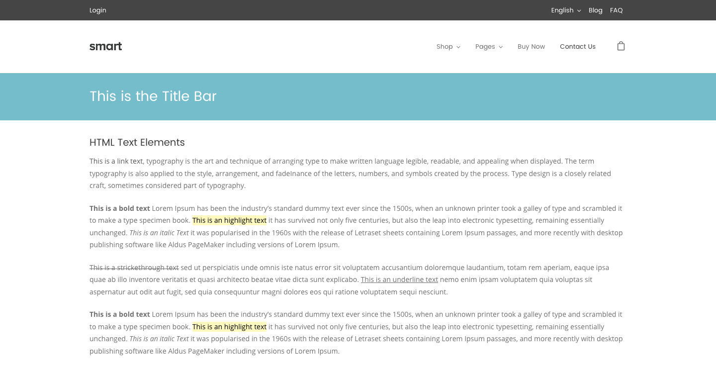
The title bar in a normal page.

The Title Bar Options are the following.

Layout

  • Height: You can set a height number and the unit (pixels, percentage, em or pt)
  • Minimum Height: The minimum height in pixels.
  • Title Horizontal Alignment: You can select to align the contents of the title bar to the left, center or right.
  • Title Vertical Alignment: You can choose to vertically align the contents of the title bar at the top, middle or bottom.

Design

  • Heading Background Color: Select the background color from the color palette.
  • Heading Skin: Select the heading skin. The options are light or dark.
  • Title Text Transform: Choose what type of text transformation you would like to apply to the title. Options are: Uppercase, lowercase & capitalize.
  • Title Font Weight: Define the font weight for the title in the title bar.
  • Heading Font Size: Select the size of the page title.
  • Heading Background Image: Upload/select a background image from the media library.

These options will define the way the page title section will look at your website. You can configure the same things for each post/page after setting these

Footer Options

The Footer Options Section will help you define your site footer layout and style.

Footer Layout

On this section, you can change your website footer layout.

  • Full-width Footer: You can choose if you want to have a full-width footer. The footer contents will take the full available width.
  • Footer skin: Select the skin you would like to have for your footer. Options are light or dark.
  • Transparent Footer: Select if you want to have a transparent background footer.

Footer Widgets

It is quite normal to use widgets on website footers. That way, you can customize it as you want. On this section, you will be able to select the number of columns you would like to have for your footer widgets section.

  • Footer Columns: Set the number of columns you would like to have for your footer widgets section.

Footer Extended

This section refers to the bar below the footer widgets section. This website section is often used to display the copyright.

  • Custom Copyright: Select this option if you would like to insert your own copyright text.
    • Custom Copyright Text: Insert the text you would like to have as the copyright text.
  • Display Social Icons: When enabling this option, you will make your social icons visible on the footer extended section (they will appear on the right part of the section).

Back To Top

The back to top button is the button you often see in the right bottom part of many websites, working as a link to the top of the page when the page is already scrolled. On this section, you can enable the button and customize its design.

  • “Back To Top” Button: On/Off, you can enable or disable it.
  • “Back To Top” Button Style: You can use the default style (one arrow only), outlined (transparent with a solid border and arrow), or solid background. If you select outlined or solid you will have more options:
    • “Back To Top” Button Shape: Round, Circle, Squared.
    • Back To Top” Button Background: Select the color from the color palette.

NOTE: Many of these options can be overridden on a page/post/portfolio basis.

Login to your Account

Welcome back! Please log in to your account by filling the fields below:

Forgot?

Not a member? Create a free account.

Create a Free Account

You're 27 seconds away from some awesome WordPress free stuff, benefits and more. Create a free account and have access to our free products, benefits and more!

Already have an account? Log in
Secure Server