Posts is a super dynamic Page builder component.
With Posts you cam mix more than 100 options without limitation to create your own layouts, which results in a vast array of possibilities.
This section describes all the available settings for the Posts component, which you can manage through our custom Page Builder integration.
General↑ Back to Top
This tab contains the main settings that define how the element items should be obtained and displayed.

Widget title
Title for the current component. It will appear before the elements are listed. Leave it blank if you don’t need a title.
Widget title alignment
Select the alignment for the widget’s title.
Options
- Left
- Right
- Center
Widget ID
The value of the id attribute for the component’s main HTML tag. It needs to be unique, and you can change it if necessary.
Module
Set the alignment type for all elements inside the component.
Options
- None: Use default CSS alignment and box sizes for all items.
- Isotope: Use the Isotope JavaScript library to align the component items.
Layout Modes
Select the Isotope layout mode that will be used to align the elements.
Options
- Masonry
- Fit rows
- Cells by row
- Vertical
- Packery
Index content
Setup the criteria that will be used to obtain the elements (posts) for the current component.
Settings
- Post types: Use this option to specify post types to populate the list of items. Default post types are
postandpage. Other post types will be provided only if certain plugins are installed and active: WooCommerce will enable theproductpost type, while Nice Portfolio will provideportfolio_project, and Nice Team will maketeam_memberavailable. If no post type is selected, WordPress will use the default value (normallypost). - Post count: The number of elements to retrieve. You can use
-1(minus one) for no limit. An empty value or0will retrieve the default number of posts for a query (normally 10). If you are using pagination for the current component, this will be the number of elements that will be displayed in a single page. - Order by: The criteria that should be used to order posts.
- Sort order: Whether the posts should be listed in ascending or descending order.
- Categories: Set the categories that should be used to retrieve posts from.
- Tags: Set the tags that should be used to retrieve posts from.
- Taxonomies: Set the custom taxonomies that should be used to retrieve posts from. Specially useful for custom post types such as
product,portfolio_projectandteam_member. - Individual Posts/Pages/Custom Post Types: Use this field to further customize the output. Only elements that are entered will be included in the list of posts. Note that this option works in conjunction with selected “Post types”.
- Author: Filter posts by specific author/s.
Module↑ Back to Top
In the “Module” tab you’ll find all the options related to the element container and the overall layout of the component.

Style
Select the general style for the list of posts.
Options
- Default: Columns of equal width containing captions of selectable height.
- Masonry: Columns of equal width containing short, medium and tall sized captions.
- Metro: Columns of normal and double width containing normal and double sized captions.
Media height
Select the size of the image caption for all items. Only available if Module > Style is set to “Default”.
Options
- Default (Square – equal width and height)
- Short
- Tall
- Auto (the image will keep its original aspect ratio)
Items gap
Define space between items. Only available if Module > Style is set to “Masonry” or “Metro”.
Options
- No gap
- Small
- Medium
- Large
- Extra large
Items gap (horizontal)
Define horizontal space between items. Only available if Module > Style is set to “Default”.
Options
- No gap
- Small
- Medium
- Large
- Extra large
Items gap (vertical)
Define vertical space between items. Only available if Module > Style is set to “Default”.
Options
- No gap
- Small
- Medium
- Large
- Extra large
Index background color
Select the background color for the list of posts. Colors can be modified, added or removed in Smart > Theme Options > Design and Styles > Colors.
Disable fluid grid
Activate if you don’t want the grid to use all the available horizontal space.
Ignore sticky posts
Activate to ignore sticky posts when retrieving the list of posts.
Pagination mode
Select if you want to have your posts paginated, and set how the pagination should behave.
Options
- No pagination
- Standard pagination
- Click to load
- Infinite scroll
Pagination top padding
Set top padding for the pagination element. Only available if pagination is active.
Pagination bottom padding
Set bottom padding for the pagination element. Only available if pagination is active.
“Load more” button outlined
Activate this to the have the “load more” button outlined (coloured border and text on a transparent background). Only available if pagination mode is set to “click to load”.
“Load more” button text
Set the text that should be displayed in the “load more” button. Only available if pagination mode is set to “click to load”.
“Load more” button shape
Set the shape for the “load more” button. Only available if pagination mode is set to “click to load”.
Options
- Default
- Round
- Circle
- Square
“Load more” button color
Select color for the “load more” button. Colors can be modified, added or removed in Smart > Theme Options > Design and Styles > Colors.
Filtering
Activate if you want the list of posts to be filterable by category or taxonomy. Only available if General > Module is set to “Isotope”.
Filter skin
Set color skin for posts filter. Only available if filtering is active.
Options
- Light
- Dark
Filter background color
Select background color for the filter element. Colors can be modified, added or removed in Smart > Theme Options > Design and Styles > Colors. Only available if filtering is active.
Filter menu full width
Active to force the filter menu element to use the full width of its container. Only available if filtering is active.
Filter menu position
Select alignment for filter menu items. Only available if filtering is active.
Options
- Left
- Center
- Right
“Show all” opposite
Activate to display a “show all” link on the opposite side of the rest of the filters. Only available if filtering is active.
Filter menu text transform
Select text transformation for filtering links. Only available if filtering is active.
Options
- Inherit (CSS default, normally un-transformed text)
- Uppercase
- Lowercase
- Capitalize
Filter menu mobile hidden
Activate to hide the filter menu in small viewports. Only available if filtering is active.
Filter scroll
Activate this to scroll to the posts area after clicking a filter. Only available if filtering is active.
Filter vertical padding
Set vertical padding for the filter. Only available if filtering is active.
Remove gap between filter and grid
Activate to remove the default space between filter and posts. Only available if filtering is active.
Posts
Select and combine the visual elements that should be displayed for posts inside the list. You can also re-arrange the default order of the elements.
Pages
Select and combine the visual elements that should be displayed for pages inside the list. You can also re-arrange the default order of the elements.
Projects
Select and combine the visual elements that should be displayed for portfolio projects inside the list. You can also re-arrange the default order of the elements. Only available if the Nice Portfolio plugin is installed and active.
Team Members
Select and combine the visual elements that should be displayed for team members inside the list. You can also re-arrange the default order of the elements. Only available if the Nice Team plugin is installed and active.
Products
Select and combine the visual elements that should be displayed for team members inside the list. You can also re-arrange the default order of the elements. Only available if the WooCommerce plugin is installed and active.
Blocks↑ Back to Top
The “Blocks” tab contains options that define how single elements should be displayed.
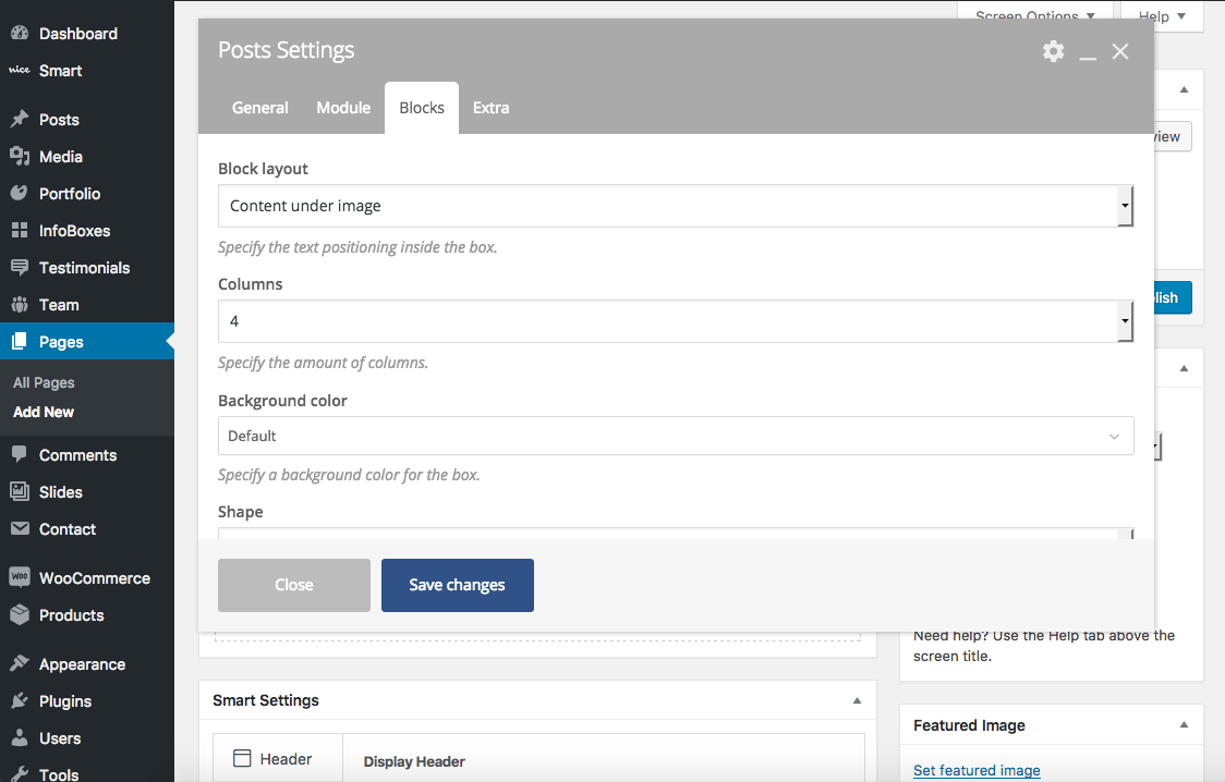
Block layout
Select the position of text elements inside an item’s box.
Options
- Content under image: Text elements will appear below the post’s featured image.
- Content overlay: Text elements will appear over the post’s featured image.
Columns
Set the number of columns (up to 12) that your post items should be organized in.
Background color
Set the background color for all your items. Colors can be modified, added or removed in Smart > Theme Options > Design and Styles > Colors. Only available if “Block layout” is set to “content under image”.
Shape
Select the shape of the post item.
Options
- Default
- Round
- Circle
Content skin
Set the skin for your post item’s box.
- Inherit (use default CSS)
- Light
- Dark
Overlay color
Select a color for the featured image overlay. Colors can be modified, added or removed in Smart > Theme Options > Design and Styles > Colors.
Overlay coloration
Select coloration style for image overlay.
- Fully colored
- Gradient top
- Gradient bottom
Overlay opacity
Set opacity for the image overlay.
Overlay text visibility
Select how text components should be displayed on top of the image overlay.
- Hidden: Text components will be initially hidden, and they will be displayed while hovering the image.
- Visible: Text components will be initially visible, and they will be hidden while hovering the image.
- Always hidden: Text components will always be hidden.
- Always visible: Text components will always be visible.
Overlay text animation
Select how the text components should be animated while hovering the image.
Options
- Animated
- Static (no animation)
Overlay text type
Select text animation type for overlay image. Only available if “Overlay text animation” is set to “animated”.
Options
- Opacity: Invisible text elements will become visible (and vicebersa) by transioning its opacity.
- Bottom to top: Invisible text elements will become visible (and viceversa) by transitioning its opacity and position.
Overlay visibility
Select the image overlay initial visibility.
- Hidden: Overlay will be initially hidden, and will become visible while hovering the image.
- Visible: Overlay will be initially visible, and will become hidden while hovering the image.
Overlay animation
Select how the image overlay should be animated while hovering the image.
Options
- Animated
- Static (no animation)
Image coloration
Select how the featured image should be colored.
Options
- Standard
- Desaturated
Image coloration animation
Select how the coloration for the featured image should be animated.
Options
- Animated
- Static (no animation)
Image animation
Select how the featured image should be animated.
Options
- Animated
- Static (no animation)
Text horizontal alignment
Set horizontal alignment for text components.
Options
- Left
- Center
- Right
- Justify
Text horizontal alignment mobile
Set horizontal alignment for text components in small viewports.
Options
- Left
- Center
- Right
- Justify
Content vertical position
Select the vertical position of text elements inside their container. Only available when “Block layout” is set to “Text overlay”.
Options
- Middle
- Top
- Bottom
Content dimension reduced
Set the width size that text elements need to use inside their container. Only available when “Block layout” is set to “Text overlay”.
Options
- 100%
- 75%
- 50%
Content horizontal position
Select the horizontal position for the container of text elements. Only available if “Content dimension reduced” is less than 100%.
Options
- Left
- Center
- Right
Horizontal padding around text
Set horizontal padding around text elements.
Vertical padding around text
Set vertical padding around text elements.
Reduce space between elements
Activate to have less space between all the text elements inside an item’s box.
Multiple click areas
Activate to make every single element inside a box clickable instead of the whole block.
Title font family
Select a font family for the item’s title. You can use the default value set for titles in Smart > Theme Options > Typography, or choose from a list of Google Fonts.
Title font size
Select font size for the item’s title from a list of predefined sizes.
Title text transform
Select text transformation for the item’s title.
Options
- Inherit (CSS default, normally un-transformed text)
- Uppercase
- Lowercase
- Capitalize
Category pills color
Select a color for category pills, when available. Colors can be modified, added or removed in Smart > Theme Options > Design and Styles > Colors.
Category pills shape
Select the shape of category pills, when available.
Options
- Default
- Round
- Circle
- Square
Category pills size
Select a size for category pills, when available.
Options
- Default
- Small
- Medium
- Large
- Extra large
Category pills outlined
Activate to have the category pills outlined (colored border and text on transparent background).
Icon library
Select an icon library to retrieve the main icon for the current list of posts.
Options
- Font Awesome
- Open Iconic
- Typicons
- Entypo
- Linecons
- ET Line Icons
Icon
Choose an icon from the previosly selected library to be displayed on top of the image overlay.
Shadow
Activate to have a shadow behind the post item.
Remove border
Activate to remove the default border from the post item.
Animation
Select the animation for the post item when it enters the visible part of the viewport.
Animation speed
Set how much time the animation should take.
Animation delay
Set how much time the animation should wait before starting.
Extra↑ Back to Top
This tab presents extra options for the component’s container.

Extra class name
Set a class name for the main HTML element containing all posts.